Do Kitchen Island Pendants and Dining Chandeliers Need to Match?
A practical guide to choosing matching or coordinated kitchen island pendants and dining chandeliers, with illustrated pairings, a step-by-step selection process, and a purchase checklist.

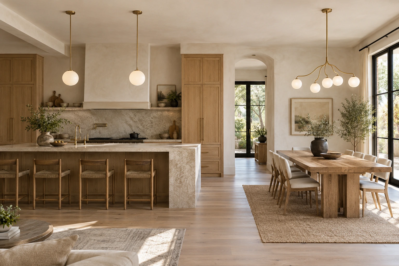
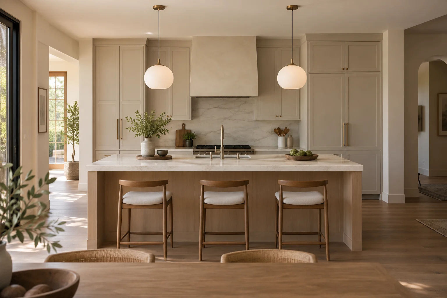
Kitchen island pendants do not need to match the dining chandelier. Choose a matched family when you want repetition, or connect different fixtures through a visible shared feature. Their scale, silhouette, and visual emphasis can then suit each zone.
That leaves you with two sound choices. A matched family creates calm repetition and can simplify the search when you like that look. Coordinated but different fixtures can make the room feel more collected and give each area its own character. The better choice depends on what is already installed, how open the view is, and whether you want the dining light or the island lights to carry more attention.
Matching family or coordinated pair?
A matched family usually repeats the same shade, frame, or overall silhouette in a related size. This works especially well when the kitchen and dining areas are compact, highly visible from one another, or already busy with cabinetry, artwork, and furniture. Repetition gives the eye an easy pattern to follow.
It is also practical when you are buying both groups at once. You can compare the fixtures as a set instead of trying to translate a design language between manufacturers or collections. A family does not have to mean identical dimensions or identical arrangements; it means the relationship is obvious.
Different fixtures are useful when the zones need different moods or when one existing light already has a strong personality. For example, sculptural island pendants can remain the visual feature while the dining fixture takes a quieter form. Conversely, a restrained island light can leave room for a more expressive dining chandelier above the table.
| Choose a matched family when… | Choose coordinated different fixtures when… |
|---|---|
| You want repetition and a calm, orderly view. | You want each zone to have a distinct identity. |
| The room is small or visually busy. | One fixture is already sculptural or dominant. |
| You are selecting both fixtures together. | You are keeping one fixture and replacing or adding the other. |
| The family offers suitable forms for both zones. | The zones need different visual weight or degrees of openness. |
If you are asking whether dining room and kitchen lights should match, start with the shared view rather than a matching label. A matched pair can still feel wrong if both fixtures overwhelm the room. Different designs can feel connected when their shared feature is clear.
How to coordinate light fixtures without making them identical
Start with one clearly visible shared cue. It might be the shape of the glass, a shade material, a repeated curve, or a similar overall visual character. One cue is a useful starting point—not a limit. A successful pair may share several subtle qualities, provided the result does not become unintentionally repetitive.
Then let each fixture respond to its setting. Island pendants are seen against the kitchen’s work surfaces and cabinetry. A dining chandelier is read against the table, chairs, and the more relaxed seated view. Their forms can differ because their surrounding compositions differ.
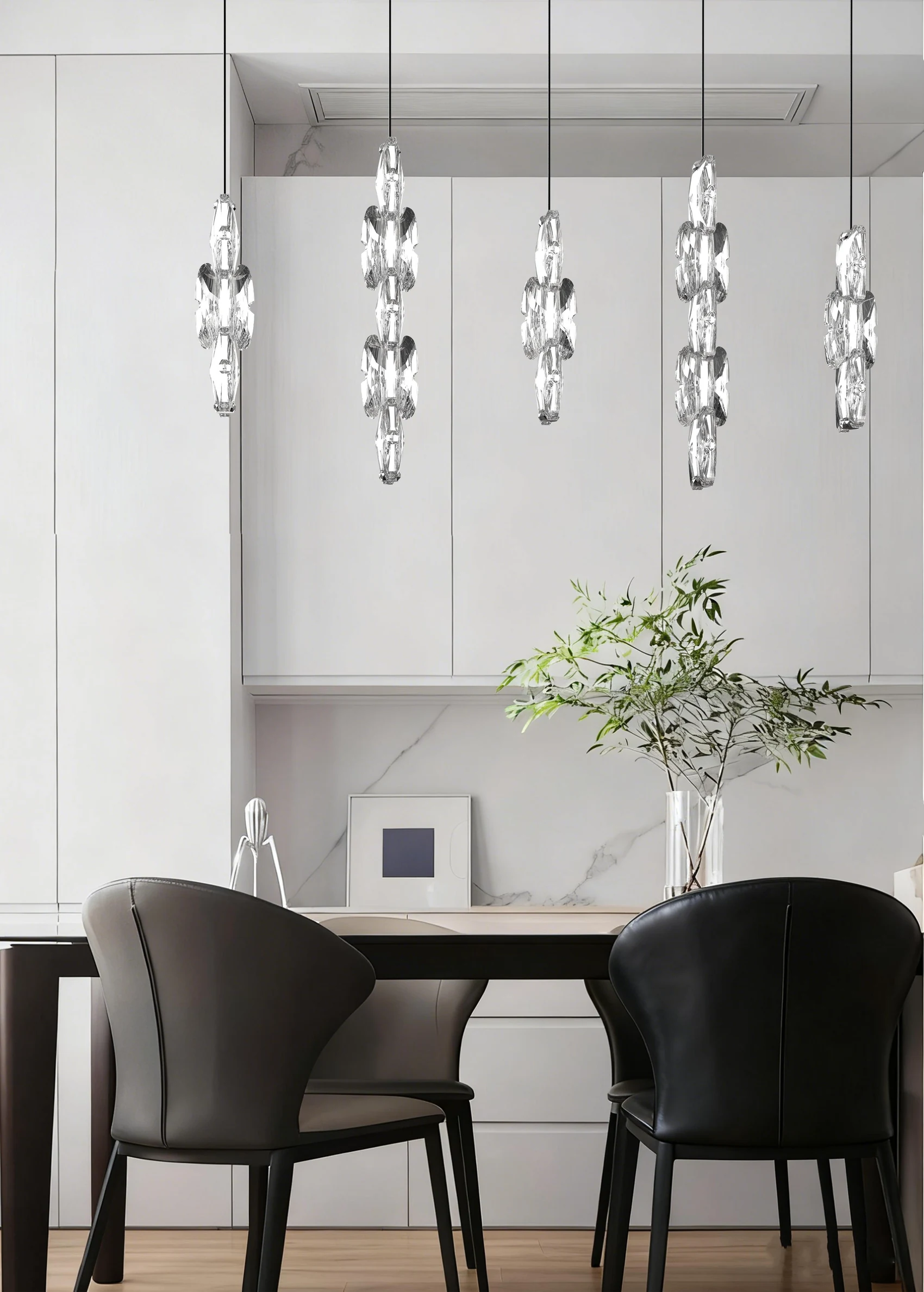
Visual weight deserves more attention than dimensions alone. A physically larger open fixture may look lighter than a smaller solid fixture. Opaque shades, dense branches, thick frames, intricate detail, and low transparency all add presence. Clear glass, slender frames, and open spacing can reduce the sense of a solid mass. Opal glass still creates a visible shape, so check the size and number of shades as well as the frame. This is why simply choosing a larger chandelier because the dining zone is larger does not automatically create balance.
Look at the pair from three positions:
- The main shared view: the approach or room-wide sightline where both fixtures appear together.
- The kitchen work view: whether the dining fixture competes with the island while you are moving or working in the kitchen.
- The seated dining view: whether the island fixtures become distracting or the dining light loses its intended presence.
For broader guidance on thinking about a fixture’s stylistic “volume” and how it complements a room, see Visual Comfort’s guide to choosing and coordinating light fixtures. Use that kind of guidance as a way to describe the effect you want, not as a mandate to buy a matching set.
Two ways to mix and match light fixtures
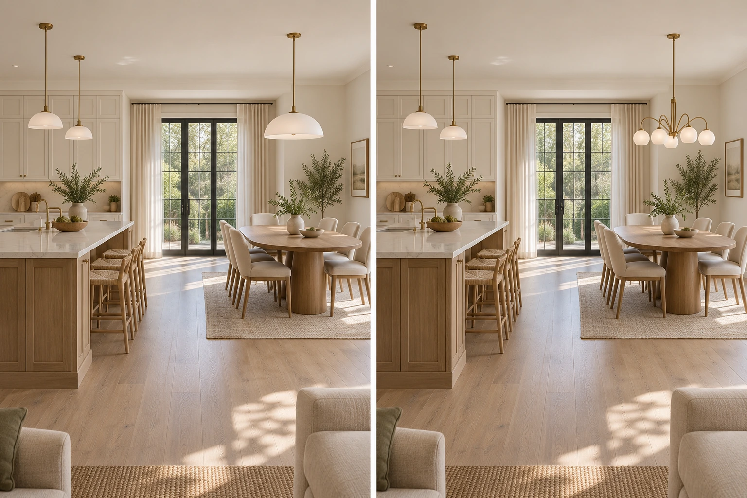
The left side of the comparison shows two small dome pendants over the island and a larger dome over the dining table. Repeating the shade profile creates an obvious family relationship, while the different sizes respond to the separate surfaces. This can work well when the architecture or furnishings already provide enough variety.
On the right, the island keeps the same small domes, but the dining light changes to an open branching chandelier with opal-glass globes. Pale shades and soft curves connect the two zones; the arms and smaller round globes give the table a different center of interest. Both arrangements are valid options to compare in your room.
For your own comparison, check each candidate’s published dimensions and place both designs on a room sketch at a common scale. Ask whether the branching form introduces too much density, whether the domes look lost beside it, and whether the dining fixture’s openness makes it feel lighter than its measurements suggest.
When comparing matching chandelier and pendant lights, view them together instead of judging separate catalog images. Use their published widths to set the same scale for both images. Resizing both fixtures to fill equal boxes hides the real size difference. Then use a room mockup or full-size paper outline where possible. A pairing that looks balanced on a white product page may read very differently against cabinets, a window, or a tall ceiling.
Choosing the second fixture when one is already installed
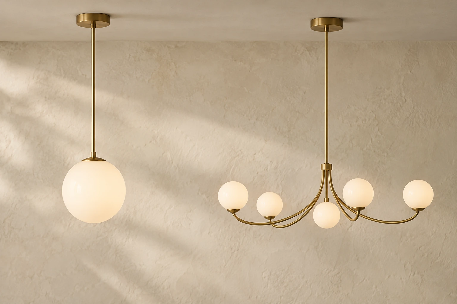
If you plan to keep the existing fixture, use it as your starting point. In the image above, the globe pendant and the branching chandelier share milky glass and curves while keeping different silhouettes. Photograph your own fixture from the shared view, record its dimensions, and note what your eye notices first: the shade, frame, curve, openness, or overall mass. Do not begin by searching for an identical item. Begin by identifying the quality you want to repeat or deliberately quiet down.
Use this sequence:
- Name the anchor’s strongest cue. Is it a rounded shade, a translucent material, a crisp geometric outline, or an airy structure? Choose the most visible cue before considering minor details.
- Decide the new fixture’s role. Should it echo the anchor, balance it, or recede so the existing light remains the focal point? The dining fixture does not always need to be the star.
- Choose what to vary. Allow the second design to change silhouette or degree of openness, but check that the change feels intentional rather than unrelated.
- Compare in the room’s three views. Check the main shared view, the kitchen work view, and the seated dining view. A candidate that works in one position may dominate from another.
- Test before ordering. Use a full-size paper or cardboard outline, a temporary image mockup, or a sample visualization. Check the real product dimensions rather than relying on the apparent size of a catalog photograph.
This workflow also helps when the ceiling heights differ. The fixtures do not need a common absolute hanging elevation simply because they can be seen together; each should suit its own surface and room composition. If you need island body dimensions, pendant count, or horizontal spacing, use Jun Lighting’s kitchen island pendant size and spacing guide. For the separate question of dining-table hanging height, see Jun Lighting’s chandelier height guide. Set each fixture’s position for its own surface and sightlines; visual coordination does not require identical hanging positions.
What to test in the actual room
Use the room’s background to test the shortlist. A branching chandelier may look airy against a plain wall, yet become visually busy where its arms overlap cabinet lines, window frames, or open shelving. Check whether you can still read its outline from the main shared view. If the details merge into a dense patch, compare a simpler frame or a quieter shade.
Also consider which group draws attention first. Several island pendants may form a stronger visual feature than one dining light, even if each pendant is individually modest. If the kitchen already leads the room, the second fixture can support that choice.
For example, reverse the emphasis of the pictured pairings. If the island pendants are already sculptural, try a restrained dining fixture with a simple shade or quiet globe form. The goal is not to make the dining area unimportant; it is to prevent two competing statements from fighting across the same sightline. Distinct zones can feel intentional when one fixture leads and the other supports.
Check the light as well as the fixture. Two related designs can still feel disconnected when one produces a noticeably cooler glow or an exposed bright source dominates the shared view. Lumens’ kitchen lighting guide discusses light color and the separate roles of kitchen light sources. Ask for the actual product’s bulb or integrated-light details before deciding; shade appearance alone does not tell you how it will illuminate the room.
Final purchase checklist
Before ordering the second fixture, confirm:
- The two designs share at least one readable cue, or you can clearly explain why their contrast is intentional.
- You have viewed them together from the main shared, kitchen work, and seated dining positions.
- You compared actual published dimensions at a comparable image scale.
- You considered density, opacity, detail, and transparency—not just width or height—to judge visual weight.
- You checked the real product’s suspension limits, ceiling suitability, required bulbs or driver, and control compatibility separately from the aesthetic pairing.
- You have not assumed that a catalog image guarantees light output, installation compatibility, or a good fit in your room.
If you want a second opinion, send Jun Lighting an enquiry with photos of both zones, the island and table dimensions, and references for the fixture you are keeping and the candidate you are considering.